
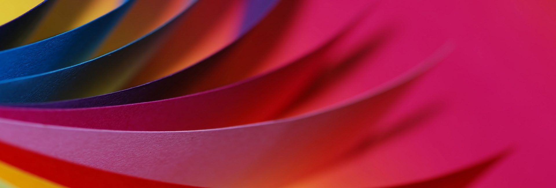
Colour conundrum
I want to take this opportunity to apologise on behalf of my fellow graphic designers out there for bamboozling you with designer-lingo. I will be taking four articles to decrypt it for you! Today we are looking at colour. Use this information with caution – if you start using design-speak with your colleagues you may get mistaken as ‘one of us’ and start receiving wedding stationery design requests left, right and centre.
RGB
Anything that is designed to be seen on screen (for example a website, an app, an online flip book etc) is classified as ‘digital’. All digital work should be designed using RGB values which are made up of Red, Green and Blue. RGB colours can be more vivid than the sorts of colours that you will find in typical print.
CMYK
For print we use CMYK values, made up of Cyan, Magenta, Yellow and Black – unhelpfully denoted with a K. When something is printed these are the four colours of ink that will be used to build up all the colours needed for the job.
Spot/Pantone
You only need to worry about these colours when you are sending something to a print supplier to be printed. A Spot colour is a uniquely coloured ink that will be used in addition to the four CMYK colours. A Spot colour may be your brand colour, or a colour that you would not be able to ‘mix’ with the CMYK colours, for example a fluorescent colour. These Spot colours have the potential to ensure your document looks on brand and add kapow! to your print job, but also expect to hear a loud ka-ching! – your print cost will be higher than a regular CMYK print job.
So there we go, a brief insight into the land of colour, I hope you’ve enjoyed it. Send us your design-speak queries and we will crack them for you. Keep an eye out for your next Luna Top Tips article.